Component Overview
In this guide we'll review each component, the configuration, and how it looks in the inspector and game.
If you are looking for the Scripting API for each of these controls, see the API Reference.
A lot of care has been taken on the inspectors to give you a single component to modify to change all the underlying components for complex controls that have several sub-components. You may still modify those underlying components outside of the provided inspector in case you would like additional controls. The most common configuration options have been hoisted up to the root component for your editing convenience.
All components can be created via the Game Object > EUIP menu. This is the preferred and recommended way to create the elements. If you need to dynamically create them, create a prefab, instantiate that prefab in your script, then modify the configuration as required.
Button
Accessible via GameObject > EUIP > Button
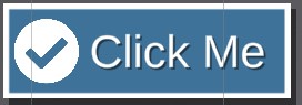
Buttons are a key part of any menu. They are foundational to user interaction for "do something". In Essential UI Pack there are 44 greyscale button presets. These can all be colored, all stylized buttons can have borders added for nearly limitless varieties.
Buttons come with 3 modes:
- Text Only
- Icon Only
- Text and Icon
You'll likely want a base configuration for your buttons that most of your buttons have slight variations on. A button always available is Save default button configuration. This will override the existing configuration for buttons created from GameObject > EUIP > Button use, meaning all your future buttons will look like that one!
Label Configuration (First Tab)
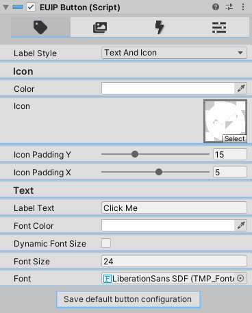
Here is where you configure how the button label looks.
- Label Style - Controls which "mode" is being used to display a label.
Text Only,Icon Only, andText and Iconare possible options. Changing this dynamically reveals other fields. - Icon Color - Visible when
Label Styleis notText Only. Controls the color tint for the icon. Exactly the same asImage.color. - Icon - Visible when
Label Styleis notText Only. The Sprite to display on the button. Will be full height of the button minus theIcon Padding Y. - Icon Padding Y - Visible when
Label Styleis notText Only. Amount of vertical padding on the icon. The icon will always be centered. Use this to control the height. - Icon Padding X - Visible when
Label Styleis notText Only. Amount of horizontal padding on the icon. Usually you want to pick a number that offsets the icon a little past the border of the button, but not so high that it scrunches your text. - Label Text - Visible when
Label Styleis notIcon Only. Text to display 😎 - Font Color - Visible when
Label Styleis notIcon Only. Color of the text. If you want a Color Gradient on the text, you'll have to navigate to theTextMeshProUGUIsub-component and update the gradient there. - Dynamic Font Size - Visible when
Label Styleis notIcon Only. Will dynamically size the text based on available space, between the Min and Max values within theFont Size Range - Font Size Range - Visible when
Label Styleis notIcon OnlyandDynamic Font Sizeistrue. Sets the min/max values for the dynamic font size. - Font Size - Visible when
Label Styleis notIcon OnlyandDynamic Font Sizeisfalse. Sets the static font size for the label text. - Font - Visible when
Label Styleis notIcon Only. TheText Mesh ProFont Assetto use for this text.
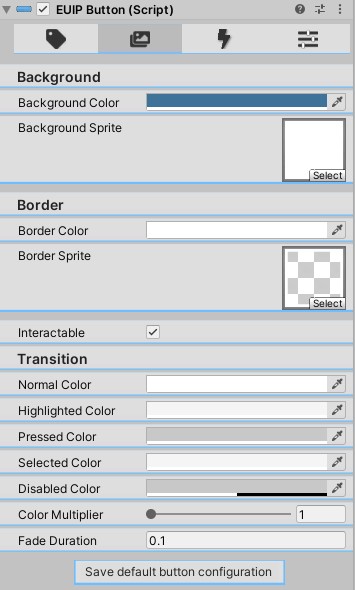
Sprite Configuration (Second Tab)
Here is where you can configure the background / border sprites, as well as the color tinting interaction colors. Most of these are self-explanatory and the same you are used to seeing on Selectable objects like Buttons.
- Background Color - Color tint for the background sprite.
- Background Sprite - Sprite for the background of the button.
- Border Color - Color tint for the border sprite. If you want no border, set this to transparent.
- Border Sprite - Sprite for the border of the button. If you want no border, to save memory, also set this to
None. - Interactable - If this button should be clickable or focusable.
- Transition - All colors under
Transitionare theColorBlockconfiguration. Defaults are the same as you get on aSelectableorButton, which are pretty reasonable most of the time. You can see the Selectable Documentation here. Note thatColor Tintis the only option supported by this editor at this time.
Actions Configuration (Third Tab)
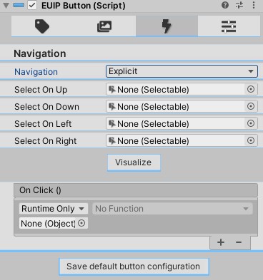
Here is where you configure the on click and navigation settings.
- Navigation - Navigation configuration.
Automaticis usually pretty good. If you chooseManualyou can explicitly set theSelect On Up,Select On Down,Select on Left, andSelect on Rightobjects. Otherwise Unity figures it out for you. - Visualize - Toggle on/off the navigation visualization.
- OnClick - The functions to call when the button is clicked, same as any other button.
Presets (Fourth Tab)
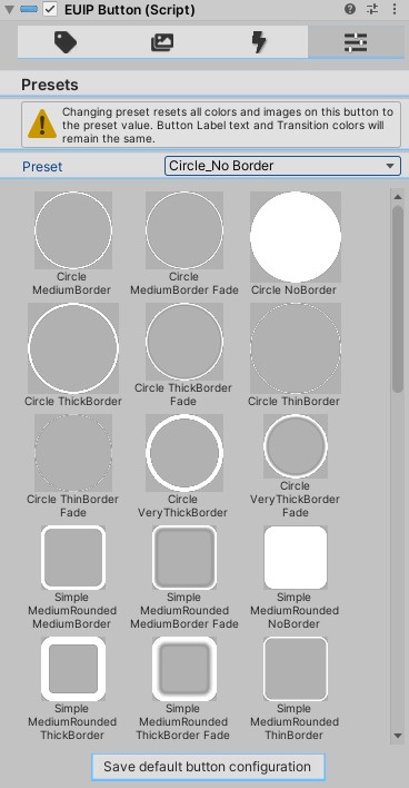
In this view you can quickly apply any one of the 44 existing presets to this button. It will override most all the settings you have, so use with caution!
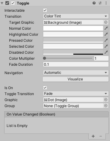
Checkbox (Toggle) and Radio Button
Accessible via GameObject > EUIP > Toggle and GameObject > EUIP > Radio Button.
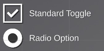
These are higher visual quality preconstructed toggles. Toggle Documentation. These can be grouped within a Toggle Group to manage several toggles or radio buttons.
Updated inspector and more control coming soon!
Dropdown (Select)
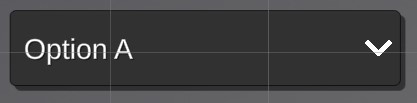
Preconfigured dropdowns with higher visual quality.
Updated inspector and more control coming soon!
Icons
- 50 Pre-assembled Rank Icons.
- Rank Icon parts xcf files.
- 1200+ Font Awesome icons in high 512x512 quality.
Input Field
Preconfigured TextMeshPro Input Field for higher visual quality.

Modal (Popup)
Accessible via GameObject > EUIP > Modal
Almost every game ends up needing some kind of popup/modal to alert the user that something went wrong, they received a gift, or maybe that something is loading. While this is a slightly different use case than Page navigation, it can be (and is) achieved in the exact same way as Pages are. The difference is a background mask, and a close button.
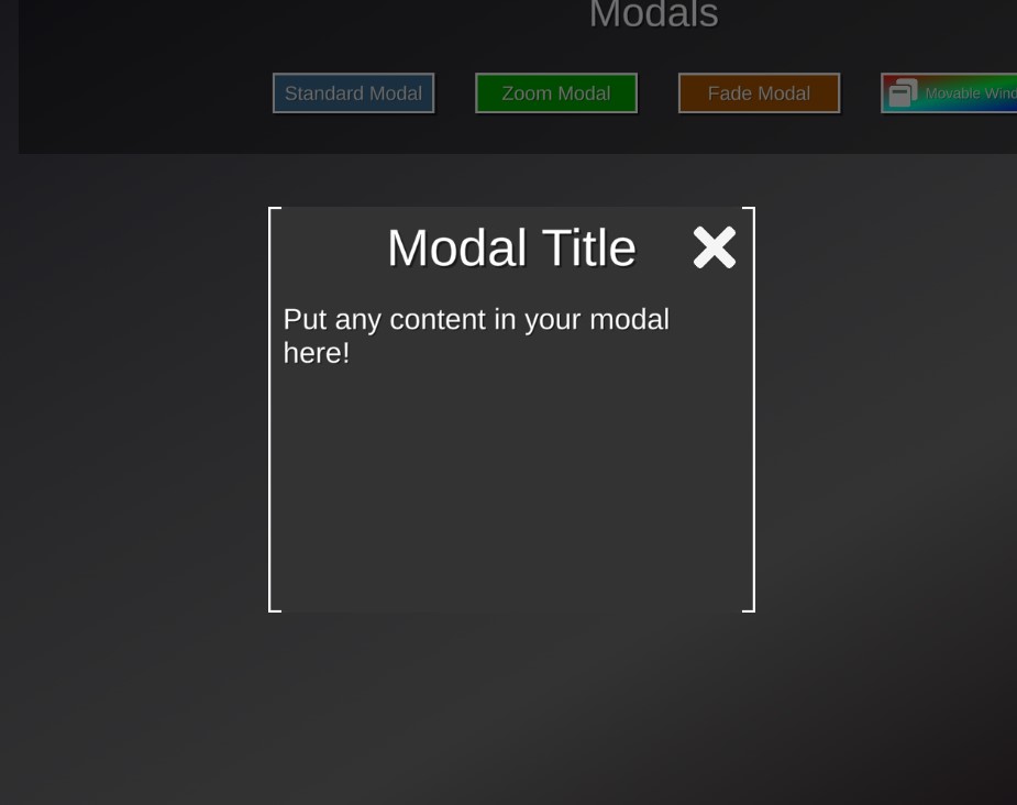
You'll notice the inspector is actually just a page.
But the hierarchy is a little different
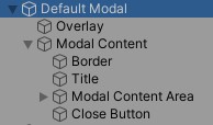
The Overlay is a mask over the background content that has an EventTrigger that should call MenuController.PopPage() (which can be quickly done clicking Tools > EUIP > Pop Page), and so should the Close Button. In certain circumstances, you will not want the modal to be dismissible. In those cases you would just not bind this close action, and instead maybe have a button within the Modal Content Area Pop the modal Page, or after some loading is complete, manually call MenuController.PopPage().
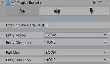
This slightly different structure requires the Modal use a different Animator Controller than the standard Page in most cases.
Using the standard Zoom None on the Page Animator Controller, or any Slide options, you'll see the Overlay zoom/slide in too, which isn't quite correct and makes your game look less professional. Instead, use the Modal controller for the Zoom - this will fade in the overlay and only zoom the modal content.
To summarize:
- Viable
PageAnimator Controller Animations are:Zoom BottomZoom TopFade
- Otherwise use
ModalAnimator Controller for a polished zoom effect like in the demo.
Coming soon - Modal Animator Controller with all Page options supported.
Draggable
The Draggable Documentation talks about it in more depth, but to have the modal draggable, simply attach the Draggable script to the RectTransform that you would like the user to be able to drag.
Multi-Value Toggle
Accessible via GameObject > EUIP > Multi-Value Toggle.
Every PC game has Graphics options, and how do you set them? Usually via this control:

This is what we call a Multi-Value Toggle in the Essential UI Pack. As you can see, it consists of a value, forward, backwards arrows, and dots indicating progress. The Sprites are all customizable via the inspector, dots can be turned off, and it supports keyboard navigation ( ⬅️ or ➡️ will change values). Optionally you can allow cycling again from lowest value -> directly to highest, and from highest value -> lowest. In this screenshot above, it is turned off, so you don't see the left arrow anymore.
![IMPORTANT] Since this is a relatively complex component it is highly recommended to configure it in the inspector via the provided editor. Manually editing, moving, and/or deleting components will likely result in this component, or the editor not functioning correctly and result in you having to recreate it.
General Configuration (First Tab)
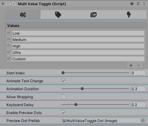 You can see the following configuration options:
- Values – the list of available options to cycle through
- Start Index – the index of the value to start on (“Low” in this case)
- Animate Text Change - whether or not to animate the values in/out on toggle.
- Animation Duration - the duration of the animation. Low values may feel rushed, high values may seem sluggish.
- Keyboard Delay - Delay before allowing toggle again via keyboard arrows.
- Allow Wrapping – if ticked, allows user to press the left arrow from the first value (“Low” in this case) and go to the last value (“Custom” in this case). Also allows pressing the right arrow when on the last value (“Custom”) and it will wrap to the first value (“Low”). Unticking it results in the arrow being hidden when the user cannot go that direction any more:
- Keyboard Delay – the left and right arrows will navigate to the previous/next value. This delay is the delay between “swaps”. A too low value will result in accidental “double taps” and a too high value will make the user feel this control is unresponsive.
- Enable preview Dots - if the dots below the value should be displayed.
- Preview Dot Prefab - the prefab to use for the dots, they don't have to be dots. They can be any sprite.
Label Configuration (Second Tab)

This tab controls the underlying TextMeshProUGUI configuration. You can safely adjust the underlying component if you would like more detailed controls. See the Text Mesh Pro Documentation for full details on what's available there.
Sprite Configuration (Third Tab)
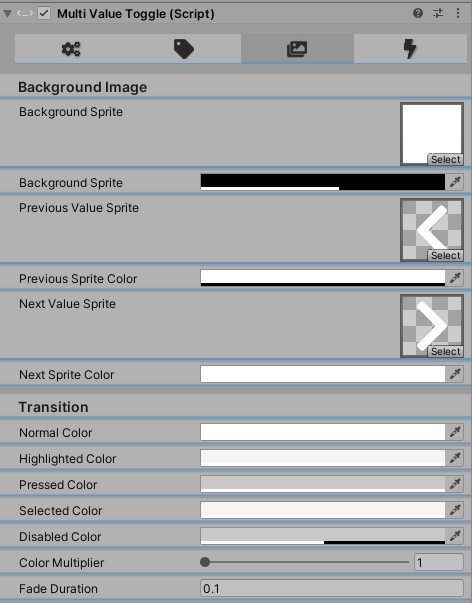
Allows configuring the Background image, arrow sprites, and transition all in one place. The transition configuration here is applied to all of the sprites, not just the background. These are the standard controls you are accustomed to with the Image component and Selectable-derived components.
Actions Configuration (Fourth Tab)
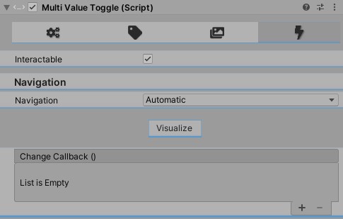
This is where you will configure any callbacks for on change, visualize the Navigation, and toggle the Interactable status of this component.
- Interactable - Will enable/disable user interaction, same as a
Selectablecomponent would behave. - Navigation - Configure the default UI navigation flow.
- Change Callback – an action to call whenever the option has changed. Useful to apply modifications on the fly instead of waiting for user to press an “Apply” button.
Popover
Accessible via GameObject > EUIP > Popover > [Direction]
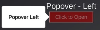
When creating a popover, select the object you would like the popover to appear next to, then click GameObject > EUIP > Popover > [Direction]. This will automatically align the popover to the element based on the direction selected.
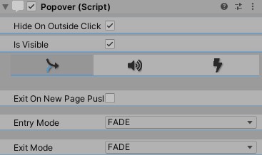
- Hide On Outside Click - When checking this, the popover will hide itself when the user clicks anywhere outside the content of the Popover. This is generally the expected behavior for popovers and is recommended to leave that on.
- Is Visible - Used to determine if the popover is visible. Set in the inspector if you would like it to be visible on scene load. Otherwise useful for checking the state.
- Page Editor - You will notice the Popover has the
Pageeditor embeded. This allows playing audio clips and firing events on appear/disappear. Since this is utilizing thePageeditor, it seems like it should support many in/out animations, but in most cases you will want to stick withFadein andFadeout.
Progress Bar
Accessible via GameObject > EUIP > Progress Bar > [Type]
Where [Type] can be Vertical, Horizontal, or Radial
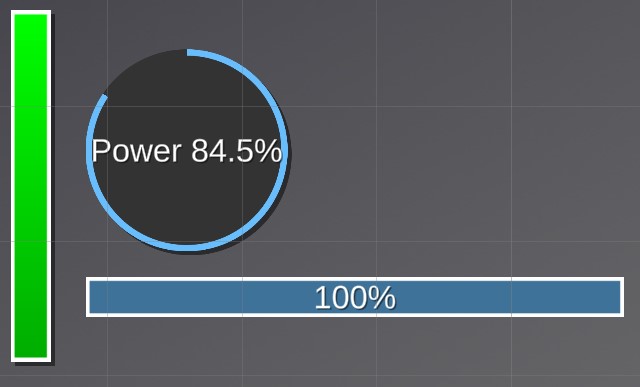
Progress bars will animate from the current value, to the desired value. With 3 variants you can quickly create the one that fits into your game's style.
Label Configuration (First Tab)
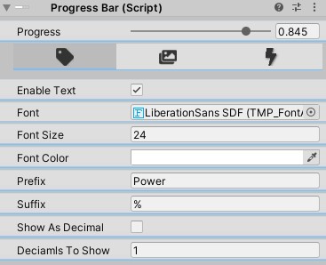
- Enable Text - If enabled, will show all the other controls. Enabling text will show the progress as text.
- Font -
TextMeshProFont Assetto use for the text. - Font Size - Size of the text to display. Dynamic font size is not recommended for this control since the numbers will change, the font size adjusting looks less professional. You can do this by selecting the
Textchild and enabling that there. - Font Color - Color of the text.
- Prefix - Text to show before the value. For example if the progress is 50%, and prefix is set to "Power " it would display:
Power 50. Leave empty for no value. - Suffix - Text to show after the value. For example if the progress is 50%, and suffix is set to "%" it would display:
50%. Leave empty for no value. - Show As Decimal - If it should display the 0-1 value instead of 0-100 value.
Sprites Configuration (Second Tab)
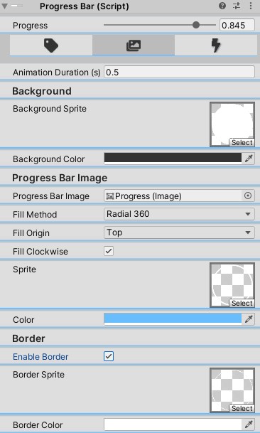
- Animation Duration - Total duration to animate over in seconds. Will update every frame.
- Background Sprite - Background sprite for the progress bar.
- Background Color - Background color tint for the background sprite.
- Progress Bar Image - Image to use for the progress bar. Will be used as a
Filled Image. - Fill Method - The Fill Method used for the
Progress Bar Image. - Fill Origin - The Fill Origin used for the
Progress Bar Image. - Fill clockwise - Conditionally available based on
Fill MethodWhether or not to fill clockwise. - Sprite - Sprite to use for the
Progress Bar Image. - Color - Color tint for the
Progress Bar ImageSprite. - Enable Border - Whether or not to use a border on the progress bar. If false, no additional controls are shown.
- Border Sprite - Sprite to use for the border.
- Border Color - Color to tint the border sprite.
Actions Configuration (Third Tab)

- On Completed - Function to call after completing the animation.
> [!IMPORTANT]
> This is not called when the progress bar has hit
value == 1. This is called when the Animation has completed playing.
Slider
Sliders are available in 3 variants. With a label, with an input field, and with just the slider. With the input field variant, pressing enter, or focusing another element will apply the number input to the value of the slider. With the label, it will update the value displayed on every change, and of course, with just the slider, it behaves as a standard Unity Slider.
General Settings Configuration (First Tab)
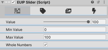
This tab is to configure the top level slider configuration.
- Value - The current (and initial) value of the slider.
- Min Value - The smallest value the slider should accept.
- Max Value - The largest value the slider should accept.
- Whole Numbers - If the slider should use whole numbers, or allow decimals.
Label Settings Configuration (Second Tab)
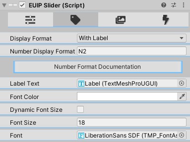
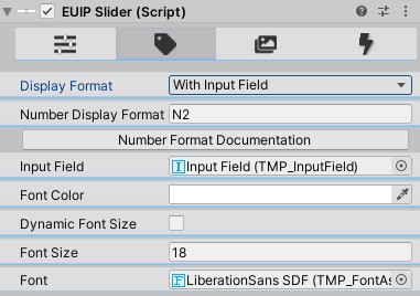
- Display Format - As stated earlier, supports 3 modes:
Slider Only,With Input Field, andWith Label. If it's set toSlider Onlythen no other options are available. Otherwise the controls are there to configure - Number Display Format - The Numeric Format String to use when formatting the value.
- Label Text/Input Field - The TextMeshProUGUI or InputField (depending on the Number Format) that will be modified on slider change.
- Font Color - Color of the text. If you want to use a gradient, you'll have to modify the underlying component.
- Dynamic Font Size - If true, enables dynamic font sizing on the TextMeshPro control.
- Font Size Range - Only visible if
Dynamic Font Sizeis true. Sets the min/max font size for the TextMeshPro control. - Font Size - Only visible if
Dynamic Font Sizeis false. Sets the static font size for the TextMeshPro control. - Font - The
TextMeshProFont Assetto use.
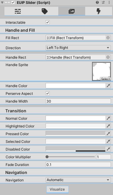
Sprite Settings Configuration (Third Tab)
This tab is where you will configure the sprites, color tints, and
- Interactable - If this slider is enabled
- Fill Rect - The
RectTransformto fill based on the value. - Direction - Which direction the slider should fill.
- Handle Rect - The Handle to use for the slider.
- Handle Sprite - The Sprite to use on the handle.
- Hanlde Color - Color to tint the
Handle Sprite. - Perserve Aspect - Whether or not to perserve the aspect ratio of the handle sprite.
- Handle Width - Width in pixels of the handle sprite.
- Transition - All colors under
Transitionare theColorBlockconfiguration. Defaults are the same as you get on aSelectableorButton, which are pretty reasonable most of the time. You can see the Selectable Documentation here. Note thatColor Tintis the only option supported by this editor at this time. - Navigation - Navigation configuration.
Automaticis usually pretty good. If you chooseManualyou can explicitly set theSelect On Up,Select On Down,Select on Left, andSelect on Rightobjects. Otherwise Unity figures it out for you. - Visualize - Toggle on/off the navigation visualization.
Actions Configuration (Fourth Tab)
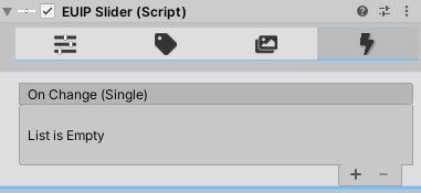
- OnChange On Change callback when the slider value is updated.
Spinner
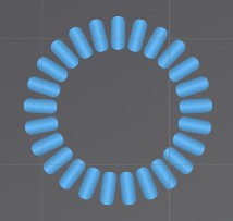
Spinners accept any sprite, and will spin around. Useful to indicate loading is happening.
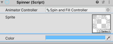
- Animator Controller - Animator Controller to use to animate the spinner.
Spin and Fill ControllerandProgress Bar Spin 1are the 2 provided by the Essential UI Pack. - Sprite - Sprite to use.
- Color - Color to tint the sprite.
Switch
Coming soon!
Tabbed Panel
Tabbed panels are more of utilities so see the Utilities documentation for full details on this.