Utilities
Essential UI Pack comes with a few utilities to help you build your game more effectively and more optimized.
Page Management
All but the most simple UIs require some kind of management of what we call "pages" in the Essential UI Pack.
Concepts
The Stack
The concept of Page Management used in this pack is a Stack. Each new page is pushed on top, and going back removes the most recent page. If you are unfamiliar with this concept, this image from Wikipedia should help visualize the concept.
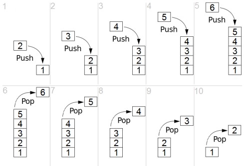
Each number (1,2,3,4,5,6) is a Page. As you travel deeper into the menu, the stack gets larger, and as we go back, it shrinks again.
Designing your UI
When designing your UI in this system, typically it is easiest to encapsulate each page as a full screen UI GameObject, and build your Page within this.
To make it easy to construct pages, you can use the menu GameObject > EUIP > Page. It will create a page in this fashion.
Take a look at the Demo Scene to see how each page is constructed for guidance on how I prefer to work. On larger projects you may consider making each page a Prefab to avoid scene conflicts.
Hooking each page up can be done via Tools > EUIP > Push Page.
Or manually by:
- Configuring an
onClickof a Button, Event Trigger, etc... - Dragging the
MenuControlleras the object - Selecting
PushPageand dragging the page you would like to push.
If you prefer to write code to manage the transitions, that is also supported (and we'll get into that farther down in the Page section).
Setting Up
If you are starting from an empty Scene, it's as easy as adding a MenuController from GameObject > EUIP > Menu Controller. This will construct a Canvas with the optimal configuration for the default page animations.
Typically, I will add a full screen background image as a child, then construct the pages as children of this. In the Demo Scene you can see this structure.
- Canvas – has the MenuController a. Background Image – just a full screen Image i. Landing Page - the first Page a user will see ii. In-Game HUD - another Page
Menu Controller
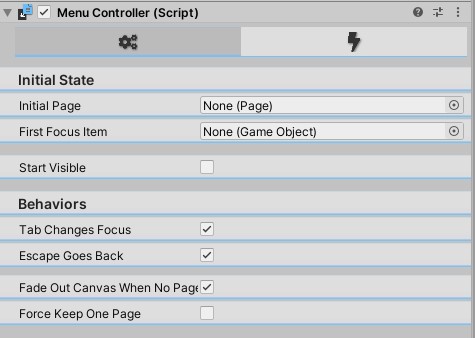
The MenuController is the primary worker to manage all the pages. All Stack management is done here.
It also controls the Tab selection of Selectables and Popping pages by pressing Escape.
These options can both be turned off by un-ticking Tab Changes Focus and Escape Goes Back respectively.
Initial Page is the first Page it will automatically Push (including transitions and audio) when the scene starts.
First Focus Item allows you to pre-focus a specific element.
If you have the use case that the menu should fade out when all pages are popped, simply check
FadeOutCanvasWhenNoPagesRemaining and attach the Fade (No Events) Controller to the Animator on the Canvas.
The user can bring it back up by pressing Escape again.
If your game is fully 2D, or you always want the Canvas visible, do not enable FadeOutCanvasWhenNoPagesRemaining. This option allows the Canvas to fade out and become inactive. When disabled, all pages can be removed by pressing Escape. To prevent this, check ForceKeepOnePage. This option will make the MenuController always keep 1 page visible. This option overrides FadeOutCanvasWhenNoPagesRemaining. Meaning if you have both checked, the Canvas will never fade out and never call OnHide events.
Page
The Page component has an important default behavior to be aware of. Each Selectable as a child of this Page will be disabled until the Page is pushed. This is done to prevent improper keyboard navigation via Tab (or any other navigation method).
Animation Configuration (First Tab)
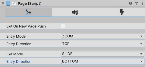
Exit On New Page Push will play the Exit animation when a new page is pushed on top of this one.
This is useful when you have no background on your page and want to reuse the primary background (as done on the Demo). If you have unique backgrounds per page, or want to see the previous page still, you can un-tick this.
You can see both Entry and Exit Mode are configurable independently, meaning a Page can ZOOM TOP IN but SLIDE BOTTOM OUT. SLIDE and ZOOM are the only Entry/Exit Modes with a Direction. Fade is a full screen effect.
Warning
Zoom Left and Zoom Right are not implemented on the Page Animator Controller provided by default, but IS implemented on the Page script. The editor will warn you that if you are using the default Page Animator Controller this animation will NOT PLAY.
If you do not use the GameObject > EUIP > Page way of constructing a page, make sure to assign the Page Animation Controller for the animations to work.
You can also create your own custom animations / Animation Controller and use that. If you need to use the advanced feature of Custom Actions, please read more about the Actions section for some warnings on how your animation needs to be set up for them to still work.
Audio Configuration (Second Tab)
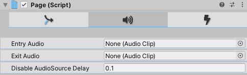
You can choose an AudioClip to play on Enter and on Exit. If you do not want page entry/exit sounds, simply leave them unassigned.
The Entry and Exit Clips will play every time a new page is pushed or popped respectively – except in the case of a page coming back in due to Exit On New Page Push. That entry will make no sound.
For example, Referring to our Stack image (square 10) above. When page 2 is popped, Page 2 exits and plays a sound. Page 1 also re-enters but does not play a sound.
Action Configuration (Third Tab)
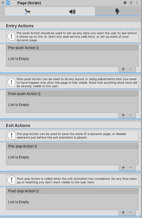
Pages also support custom actions. This most likely requires some code from you to do something. In the inspector there is some help about exactly when each action will be called. There are 4 timings on the events:
PrePush– before the push happens, call these actions.- In general, this is a good place to start any web service calls (if you didn’t do it on Start), do dynamic element creation, or do any state setting.
PostPush– after the push is complete (animation is done), call these actions.- This is a good place to put any post-render layout adjustments. For example: resizing a
ScrollRectContent area to fit dynamically generated content, and scroll to the top. Be aware that anything done here is done while the user can see the page!
- This is a good place to put any post-render layout adjustments. For example: resizing a
PrePop– before the pop happens, call these actions- This is a good place to save the state of a page before it goes off screen. Be aware that anything done here is partially visible to the user since it will start happening while the page is still visible.
PostPop– after the pop is complete (animation is done), call these actions.- This is a good place to reset the state of a page while the user cannot see it, or do any garbage cleanup.
Creating Custom Animations
Since we want a generic way to call PostPopAction and PostPushAction after an animation has completed, and don’t want to make you input "the animation is 0.235 seconds long" on each page, we raise an AnimationEvent (see the Unity Documentation for how to set them up) to handle calling these methods. This means when you create an Animation you want to use, it is highly recommended you add an AnimationEvent on the last frame. If you do not do this you will receive warnings in the console.
Important
You must set the Function on OUT animations to be "CallPostPopAction" and set the Function on IN animations to "CallPostPushAction".
Connecting Page and Menu Controller
From the Inspector you can fully define all animations from your menu with absolutely no coding. For the common use case of clicking a button causing page navigation, we can do the following:
- Add a Button to the page
- Click
Tools > EUIP > Push Page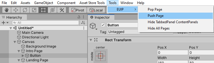 That's it! The Push Page menu will hook up your
 OnClickaction on the button to push the next available page.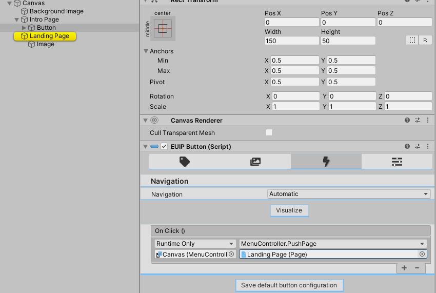
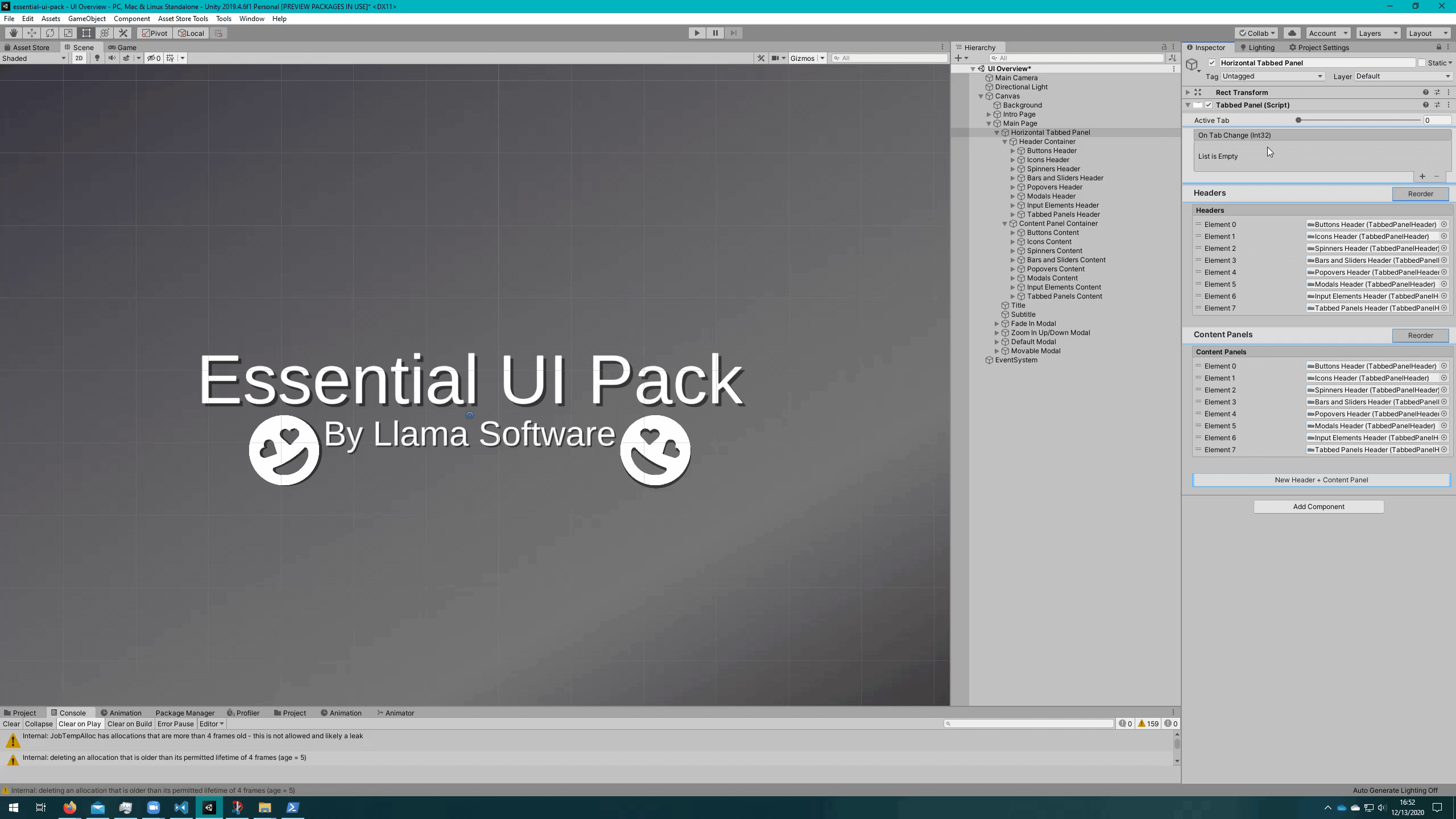
Tabbed Panel
The entire demo scene is a tabbed panel. There are 2 variants available. Horizontal (like the one in the demo), and Vertical (where the headers are on top, and content is below).
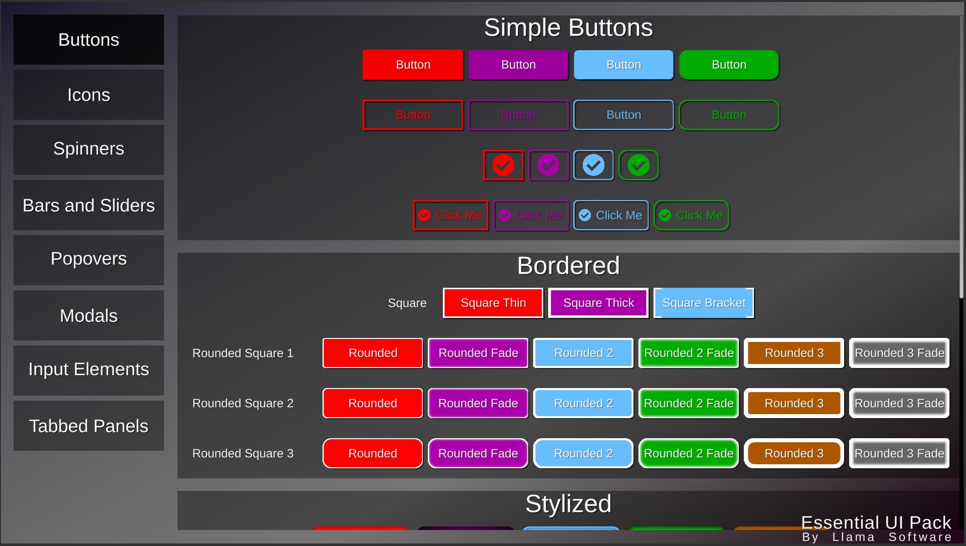
The left side is the Tabbed Panel Headers and the right side is the Tabbed Panel Content.
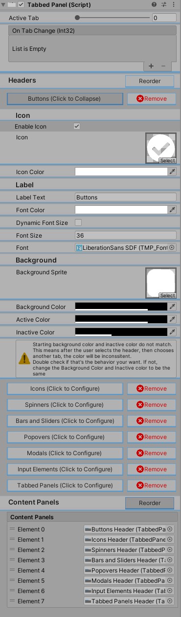
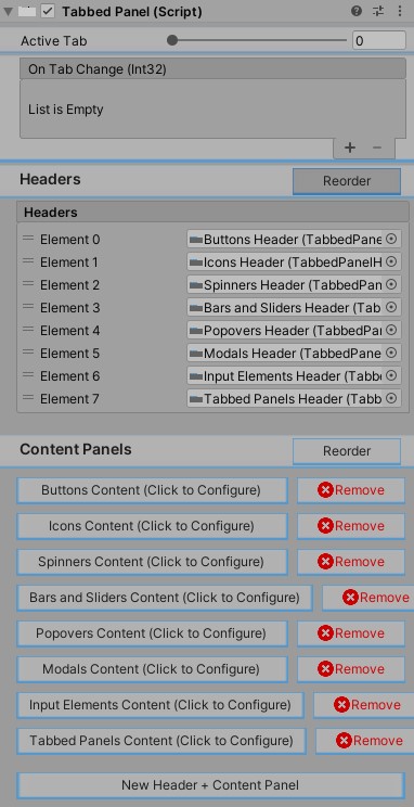
From these inspector screenshots you can see that the Tabbed Panel controls the sub-components of the Headers and Content Panels. Click New Header + Content Panel to add new sections.
Click on the button that corresponds to the header you would like to edit to get the expanded editor that gives you full control of that header.
Click the button that corresponds to the Content Panel you would like to edit to get the Page editor you are already familiar with.
Important
When entering Reorder mode. As you reorder the HEADERS it DOES NOT reorder the content panel. This was an intentional decision to ensure you could easily reorder headers and content panels individually.
Instead, if you would like to move (using the demo as an example) the Popovers below Modals, first drag the Popover header down below the Modal header, then, you'll notice the names of content panels are updated, but the content of those pages are not accurate. On the Content Panels you would drag the one now named Modal down below the one named Popover to get the desired effect. See the below video of exactly this situation.
Tabbed Panel Headers
- Enable Icon - If enabled, adds an Icon to the header.
- Icon - Sprite to use for the icon.
- Icon Color - Color to tint the sprite.
- Label Text - Text to display on the header
- Font Color - Color to tint the text. If you would like to use a gradient, you can update the underlying TextMeshPro component.
- Dynamic Font Size - If the text should be dynamically sized.
- Font Size Range - Only visible if
Dynamic Font Sizeis true. Range to dynamically size the text within. Sets the min/max font size of the text component. - Font Size - Only visible if
Dynamic Font Sizeis false. Static font size to set for the header text. - Font -
TextMeshProFont Assetto use for the text. - Background Sprite - Sprite to use as the background of the header.
- Background Color - Color to tint the background sprite.
- Active Color - Color to interpolate to when the header is active.
- Inactive Color - Color to interpolate to when the header is inactive.
Tabbed Panel Content
This is the exact same editor as a Page! See Page Guide for full details.
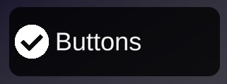
Button Click Sound Player
While slightly misnamed, this is an optimization component.
Finds all Button, Event Trigger, and Toggle components and adds an onClick / PointerUp / onValueChanged event respectively to each of them that plays the provided AudioClip.
The purpose of that is to batch all AudioSources for each of these components into a single AudioSource.
Each AudioSource in the scene has some CPU overhead. Batching controls that will play separately allows a great reduction of AudioSources in the scene, and thsu frees many CPU cycles. This comes at the downside of each control should utilize the same AudioClip.
If you would like different sounds for a Button click versus a Toggle change, you can attach 2 of these components to the root Canvas and configure one to IncludeButtons = true and one to IncludeToggles = true.
Gradients
Essential UI Pack comes with 2 gradient options: Corners UI Gradient and RotatableLinearUIGradient.
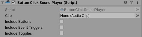
Corners UI Gradient
 Applies one color per corner vertex and linear interpolates between each.
For most use cases you'll want the the Image color to be white. Otherwise the gradient will have whatever the base color tint is blended with the provided gradient.
Applies one color per corner vertex and linear interpolates between each.
For most use cases you'll want the the Image color to be white. Otherwise the gradient will have whatever the base color tint is blended with the provided gradient.
Rotatable Linear UI Gradient
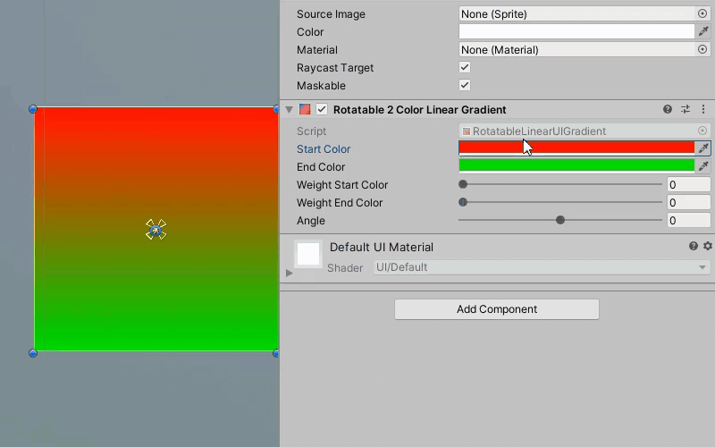 Linearly interpolates between 2 colors, can be rotated and can add additional weight to either color. GIF above has some compression artifacts, there are no additional lines on the image as a result of applying this script (as seen in demo videos :)).
For most use cases you'll want the the Image color to be white. Otherwise the gradient will have whatever the base color tint is blended with the provided gradient.
Linearly interpolates between 2 colors, can be rotated and can add additional weight to either color. GIF above has some compression artifacts, there are no additional lines on the image as a result of applying this script (as seen in demo videos :)).
For most use cases you'll want the the Image color to be white. Otherwise the gradient will have whatever the base color tint is blended with the provided gradient.
Draggable
Simply attach this script to any RectTransform and it can be dragged as long as the mouse is held down within the bounds of that Rect Transform. Movable windows, modals, or any other thing you want to be moved!